Walter de Maria and Pierre Huyghe – A Conversation Part II

Screen Shot 2019-04-29 at 22.03.44

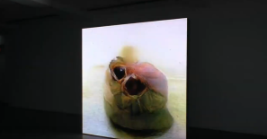
Pierre Huyghe Uumwelt (From the Serpentine Gallery Guide)

After a fairly long break Richard Guest and I visited two shows – Pierre Huyghe: UUmwelt at the Serpentine Gallery and Walter De Maria: Idea to Action to Object, at Gagosian, Grosvenor Hill. This is the resulting email conversation, in two parts. You can read part I here

Richard:

Making a simple comparison between the two exhibitions, Huyghe is ceding his creativity to a machine, with the expected in/ un-human result, whereas de Maria’s work is not only driven by utopian ideas, but is all on a human scale – there are balls to pick up and drop, human interaction is imaginable (and encouraged in his drawings) and looks like it would have a satisfying tactility.

I’d like to see more work by Huyghe to get a better sense of where he’s coming from – is it all at this vast remove? The larger de Maria works seem consistent with the works in this show – Lightning Field and Earth Room still work on a human scale, are understandable as concepts and a person could interact with them.

I think conceptual art has changed a lot in its intentions over time: ideas are being expressed for different reasons now than they were in the 1960s and 1970s. It’s quite an enduring form in a way, but is Huyghe an artistic descendant of de Maria?

David:

Interesting that you say Conceptual Art is an enduring form – since it was originally fundamentally opposed to form – it suggests that it has defeated itself or been consumed by the market. I am not sure that’s really a fair analysis though.

The Dadaists were the first to sever the link between the Object and the Idea. They were the first Conceptualists. But now that has spawned so many subgenres: some are just ideas without objects and some are objects without ideas. ‘A concept in search of an idea’, as we used to say!  The difference would be that some of these empty object based artists now describe themselves as Conceptualists: although their work is as decorative and devoid of meaning as any flower painting or animal sculpture.

But there was something right about the overall plan of Dada – it was partly a reaction to photography and mechanisation that threatened to democratise art to the point where skill based reproduction of the visible world was immediately obsolete. Today that process has all but overwhelmed the creative impulse as we are swamped with everyone’s ‘creative’ images, but that is not all. I would argue that the pervasive framework of the internet has made it almost impossible to have an original idea, or even to believe that you have had one. This has led to artists like Huyghe, who are trying to think their way back to the possibility of an idea emerging in the brain unprompted by the collective consciousness. That is what this work was about and – although it wasn’t completely successful for me  – it did have a mind’s eye kind of quality to it as if you were witnessing a visual idea take shape. That’s pretty amazing and yes, quite original.

De Maria seems to have had no such difficulty in owning ideas and feeling that they were original and exciting (even though some of them might not have been). So, in answer to your question, although they are both related to the roots of Conceptualism they are from very different branches. But I could be completely wrong! I am not sure if either of them are as in earnest as they seem at first glance. In particular, I feel I don’t totally fathom de Maria’s humour – how do you perceive that, especially in relation to some of the very dry looking sculptures he came out with..?

DSC00004

Walter de Maria at the Gagosian

Richard:

I’m not sure it’s humour so much as light-heartedness. There’s a generosity of spirit behind the drawings, and a sense of inclusiveness to the sculptures. There’s also no mystification to the process: Walter makes a drawing setting out what he intends to do (annotated in plain language), and executes the sculpture according to the drawing – there’s seemingly no barrier/ framing device between him and the viewer. (Hi, I’m Walter, this is my idea, hope you like it!) It’s all of a piece with his Utopian intentions I think. I appreciate what you’re saying about Huyghe and his originality and I agree, but the work is troubling and alien and (without any kind of background reading), opaque. To what extent do you think it’s important that exhibitions are supported by texts? With both of these shows I went in with very little prior knowledge and trusted my reactions to the work without the gallery’s framing context.

David:

This is a question we always come back to. I want to feel that anyone can interact directly with art without background information from the priesthood of critics and gallerists, without other peoples’ interposing opinions or even the artist’s own backstory of the work. I want art that has the power of creation within it, not some weak commentary or reflection flaking off our society like a dry scab.

However, this also means that as a viewer I have to be in a pure state of mind and heart, unclouded by irrelevant thoughts. And the gallery itself would have to be some perfect bubble of contemplation. This is only partly possible…when art works, it is like a radio broadcasting the artist’s mind, and all this other stuff is like static around that signal. But to feel meaning in it, art cannot be wholly disconnected: it has to strike a resonance with my life and experience. Without that – it’s just junk.

On the one hand it is really exciting to have that connection with an artist whose life is remote to mine, but it is necessarily harder to establish that connection and what can be communicated is less detailed and specific. Probably it is restricted to what used to be called The Human Condition, although you don’t really hear that phrase much anymore. All ephemeral or topical content quickly becomes lost.

Art criticism is a kind of oral history that no-one is curating. Its development will be lost – and that is probably a good thing; but we will find the art of the recent past to be almost inexplicable when it is primarily oriented to that critical debate. And if I’m honest I see both de Maria and Huyghe in that camp.

Walter de Maria and Pierre Huyghe – A Conversation Part I

Walter de Maria at Gagosian Grosvenor Hill

After a fairly long break Richard Guest and I visited two shows – Pierre Huyghe: UUmwelt at the Serpentine Gallery and Walter De Maria: Idea to Action to Object, at Gagosian, Grosvenor Hill. This is the resulting email conversation, in two parts.

___________________________________________________________________________________________

David:

Visiting these two shows was not any kind of programmatic choice – they aren’t related for me in any way. I think we both found the Huyghe show hard to digest; but, rather against expectations, the de Maria was quite playful in a laconic sort of way.

Walter de Maria is one of those artists who seem to embody the pioneering conceptualism of the 1960s and 70s. Rare pictures of him seem to give off both the romantic elan of early Surrealists and Dadaists but also the gravitas of the Los Alamos bomb makers and other highly serious types. I hadn’t seen a lot of his work in one place before and I was keen to see the Gagosian show to give me a strong taste of what his work was really about. Once again my expectations were upended – it seems to happen whenever I go to see a show! Are there a lot of revisionist curators around or did I just get totally the wrong end of the stick about all this stuff when I was younger?

Richard:

Ha, ha, quite – the Walter de Maria show was a real surprise.

As a teenager I took artists a lot more seriously at the same time as not bothering to research them too deeply. When we were at art college, Walter de Maria was talked about by respected tutors with some reverence. So I assumed he was a “very serious artist” and the works I was familiar with (from books and magazines) did not dispel this view. The two pieces I remember being particularly interested in: Lightning Field (1977) and The New York Earth Room (1977) were both large in scale and seemed rigorously disciplined in their thinking.

Here’s a video about Lightning Field:

Screen Shot 2019-04-27 at 00.18.39

and here’s one about The New York Earth Room:

Screen Shot 2019-04-27 at 00.39.47

Although there is no relation between the Pierre Huyghe and the Walter de Maria, I think it could be interesting to compare and contrast our experiences of the two shows. Here’s Bjarne Eriksen’s experience of the Huyghe:

Screen Shot 2019-04-27 at 00.44.06

One thing the video does not convey is the weird (rotting meat?) smell that clung to the exhibition, which coloured the whole experience for me and made me want to leave perhaps sooner than I should. The show comprised: large screens showing what appeared to be glitchy video of forms mutating, patches of wall where previous layers of paint had been revealed by sanding, lots of live houseflies, and the odour. It felt a bit like walking around in someone else’s nightmare.

David:

The smell and the flies were definitely important! When you are first getting interested in art, exposure to photos, books and videos (and of course blogs!) seems to tell you everything, but it’s often incomplete and there are whole dimensions missing. Especially when the work isn’t completely visual. On the other hand, it’s easy to get wrapped up in understanding the intention of the artist and the processes behind the work without stepping back to look at the work itself. And sometimes all the process and attitude is lost in the finished work. But as followers of the Cult of Personality, we get very wrapped up in attitudes, politics and other ephemeral stuff. I like to try to separate what I see or smell in front of me in a gallery from all the received information around, which is almost impossible. Usually the only way is by receiving the information afterwards!

SONY DSC

Walter de Maria: drawing for Olympic Mountain Project (1970–71).

Although De Maria was a bit of a local hero when we were students, I don’t think he was ever mainstream and a lot of these works are being exhibited for the first time at the Gagosian, so perhaps we can be forgiven for not fully appreciating his playful side. Part of which would seem to be about aping the high seriousness of some of his more po-faced contemporaries. The large works you mention are also very different in character from what is on show here. There are a lot of sketches with quirky captions and comments that really reveal his thoughts in a very spontaneous way. I connected them mentally with Claes Oldenburg – the epitome of a witty, playful artist. What did you make of the drawings? Can we call them drawings?
Richard:

Yes, I’d call them drawings – de Maria making propositions, giving form to ideas. They are playful, but informative enough that he communicates the sense of how a concept could be enacted. (DSC00170.jpg)

I like his drawing style – it gives the impression of concentration and spontaneity – de Maria is “present” in the moment. None of the drawings in the exhibition look overworked or over-thought.  They are spare and light and communicate just enough of an idea to bring it to life in the mind. And I think this lightness of touch translates to the objects he made.

In contrast to de Maria’s approach I feel like Huyghe’s work is grinding away at some opaque concept, one that is close, oppressive and pessimistic. Am I misreading Uumwelt because I’m comparing it to de Maria’s utopianism?

David:

For me the overall impression of the Huyghe was of timelapse security camera footage of decomposing aliens, but that was beside the point. The process was the point…the suggestion that images can be generated by machine learning and could be formed by computers interfacing directly with the human brain is a fascinating one. But the images themselves felt like layers of graphics and noise. By contrast de Maria seems to have compartmentalised his creativity very differently – and more humanly. It’s very down to Earth…the title “Idea to Action to Object” really seems to describe an artist’s working process perfectly. The object is the direct product of the action which is the consequence of the idea. The internal idea is brought into the world in the turmoil of action and the only evidence of it is the object. When the action is concluded the wormhole between the idea and the object is closed; and the object stands alone on ‘the other side’ – a clean break.

Huyghe seems to be trying to skip the ‘action’ step – to paint, or perform or write – and to have the idea translate itself directly into images. But of course the process becomes the action, the machine is just the outsourced hand of the artist. I felt Huyghe is almost afraid of owning the idea: almost as if he wanted the machine to arrive at his idea so he didn’t have to. Not because it would be too much work, but because it feels more ’empirical’ and less tied to some personal value system. Before seeing the de Maria show I would have said this desire to distance yourself from your own ideas was the legacy of Conceptual Art, but now I’m not so sure.

Part II 

Jasper Johns: A Conversation (part three)

key 50

Jasper Johns: ‘Fools House’ (1961-2)

A couple of months ago Richard Guest and I visited the Jasper Johns exhibition ‘Something Resembling Truth’ at the Royal Academy in London. Then we exchanged emails about it, and this is the result.
* * * *

Richard:
Those are great quotations; I think he’s being honest, and they explain the work’s strength and its durability – the paintings have no fixed meaning and Johns never sought to impose one. I like the idea that the artist paints, writes, draws, records etc in the way they are able, because they have to (get something out there).

Yes, I think the key to the work’s appeal is its sensual quality – the images are seductive, in part because of their texture, because the hand of the artist is visible. And the tension between the concept and Johns’ intuitive delivery are what grip us.

Can we talk about Fool’s House (1961-2)?
 
David:
Indeed! For me Fool’s House is ‘the one’ where it all comes together. I wasn’t really expecting it, unlike the flags and targets, but it brought a smile to both our faces (which is an amazing accomplishment). It was able to do that because – I think – it is so right. The balance between the conceptual and painterly elements is perfectly struck – there is a kind of rich counterpoint between them, a perfect tension between the real and the depicted, the word and the gesture, the planned and the spontaneous, the intention and the act. The action of the broom sweeping the paint in the arc is balanced against the frozen nature of paint, the hanging of the broom and cup on hooks that suggest they could swing…the writing on the canvas, naming the articles correctly – a slap in the face for Magritte – but there more. Johns revered Marcel Duchamp we are told, but this feels like a robust defence of painting, a giant leap beyond Duchamp’s barren late work. It feels like a more personal painting too, somehow. How did it strike you?

Richard:
Fool’s House was one of the biggest surprises for me – I’ve seen so many reproductions of it, but nothing prepares you for its raw, pugnacious, visceral effect. Duchamp’s coolness has been replaced by the heat of creation. It’s a dense work – conceptual, jokey, handmade and very much alive! A tangible object in the world and one that seems to be making a proposition: art can be this way (which would be taken up by lots of painters, particularly in the eighties); it doesn’t have to be purely conceptual or purely gestural.

The objects: broom, stretcher, towel, cup could all be found in the typical painter’s studio – is Johns referring to himself as a fool (the stencil used to title the painting is very similar to those used by removal firms to label wooden tea crates)? If so it’s a nice personal/ autobiographical byroad to go down and lends humour and tenderness to the work. The laconic labelling of the objects can be read in a couple of ways – this is a cup (a la Magritte) or the cup goes here. I like the second interpretation, because it suggests a fussiness about the arrangement of objects in a space.

There’s a lovely tension between the actual (the objects) and the world of the imagination (the paint marks). Gestural, suggestive paint marks allow the mind to wander, to create images in the murk. The area to the right of the broom records a lot of activity – maybe something was painted in and painted out again. I wonder if this prompted Johns to paint in the other grey areas, creating a composition he found pleasing on a purely visual level. Containing the whole in a frame emphasises the action of the mark making as well as the cup being simultaneously part of and outside the painting.

For me there’s a rawness to Fool’s House, it’s an open work: there’s space for the viewer’s imagination to complete the picture. And there’s a real tenderness there – an attempt at preserving a snapshot of a life? – casting about to save a few things as the ship goes down…painting as life raft…

David:
Fool’s House is at once a gathering of ideas and a spontaneous expressive moment from an artist’s life. It does remain open to interpretation in a way that some of his other work perhaps doesn’t – I have read conspiracy style theories about it online – that it contains a self portrait, that it contains rosicrucian style references to Raphael and Vermeer etc etc. Not very plausible mostly, but pointing to the the dualistic character of so much of Johns’ work: a cerebral practicality versus free expressive openness. He does not duck any of the hard questions about painting but he remains free to paint any way he wants. Quite an achievement.
 
key 98 ALT

Jasper Johns: ‘Regrets’ (2013)

* * *

Jasper Johns: A Conversation (part two)

key 233

Jasper Johns  ‘Flag’ (1958)

A couple of months ago Richard Guest and I visited the Jasper Johns exhibition ‘Something Resembling Truth’ at the Royal Academy in London. Then we exchanged emails about it, and this is the result. 
* * * *


Richard:
I think the subjects are very specifically chosen – they have deep roots in the Western psyche – a target is for shooting at, so we think about the implications of that image; numbers underpin our lives and shadow our activities in all sorts of ways (data, economics etc), maps and flags signal ownership of land. These objects are all so much a part of everyday existence for so many people that they are taken for granted, but they hold fundamental meaning – road signs, logos, labels are ephemeral by comparison. So, I wonder whether Johns used the maps, flags, numbers and targets to stimulate some kind of intellectual/ tactile reverie in the viewer. If so, to what end? I don’t think his concerns were ever aligned with those of the Pop artists; he was looking beyond labels and design at deeper human experience.

David:
They certainly are very old and as near to universal as you could wish for. On the other hand he chose that particular flag (Stars and Stripes), and that particular map (of the U.S.A). As far as I know he stuck with them. Similarly he has never varied the typeface for 0 through 9 – it’s always the same typeface that is depicting the numbers. A font so old from the days of stencils it probably doesn’t even have a name. It’s almost as if what started as an unconsciously chosen symbol has evolved a deeper aspect and what we have ended up with is a series of portraits or views of a specific landscape – like Frank Auerbach painting the same models for fifty years or Cezanne or Hokusai revisiting the same landscape in different seasons or from different viewpoints. Is it possible he finds them somehow almost as real as people…in some way anticipating a kind of abstraction or virtualisation of our physical lives?  Johns’ work somehow embodies the moment the standard of living in the States was suddenly way better than anywhere else on the planet, but without depicting a refrigerator or a Lincoln Continental. When the materialist ephemera of our culture has long disappeared, it Johns’ work a fitting encapsulation of that moment, a monument to it even?

Richard:
Not a monument. Or an encapsulation. I think both terms are too static to capture the nature of the work. The work is simultaneously a part of and comment on the time – Johns is right in the thick of things – the US cultural debate – questioning his times and positing ideas for a future. His art lives and breathes still – its meaning changing with the political, social, cultural tides. This is another difference with Pop, which for the most part represents a fixed point in time in terms of what it’s saying. Johns’ work somehow embodies a complex representation of the American experience. On the one hand, it is complicit with capitalist values (the art market being a  model of the system in microcosm, and the soaring value of his work within it) and on the other it seems to undercut it, by pointing to objects that define everyday life and saying here are your rulers: discuss. The hand of the artist is in the service of these iconic/ monumental images, and is necessarily humble, which I think raises a question of scale.


David:
One thing for sure is that he himself never attempts to explain his work, its origins, its ideas at all. It’s not his job. He is the master of the unhelpful artist-on-the-subject-of-their-own-work quotation. Here are a few:
“One works without thinking how to work.”,
“I don’t know how to organise thoughts. I don’t know how to have thoughts.”
“I have no ideas about what the paintings imply about the world. I don’t think that’s a painter’s business. He just paints paintings without a conscious reason.”
“I assumed that everything would lead to complete failure, but I decided that didn’t matter –- that would be my life.”

I don’t think he is being deliberately unhelpful here, (although bizarrely it made wonder how Marcel Duchamp would have fared on the Graham Norton Show), I just think his angle of attack is so oblique relative to almost any other artist it is very hard to explain it in simple terms. This is perhaps more revealing:
“I think that one wants from a painting a sense of life. The final suggestion, the final statement, has to be not a deliberate statement but a helpless statement. It has to be what you can’t avoid saying.”

This hints at the transcendent quality of the work. The borrowed starting point (the real thing – map, target, flag etc ) kick starts the work, before Johns takes it over and remakes it in art. The process through which the canvas is covered by the addition of paint is also a process of reduction – if the supplicant is honest and without ego. What remains has the essence, the life that the artist was seeking to put there.

It’s not cerebral – in the sense you need to think about it to understand it – but it HOLDS the mind. It is not a concept that has been merely executed, (a sense of the death of an idea there), but an idea that has been allowed to take flight – or to become manifested through – a (to me) surprisingly traditional and intuitive process of painting.
key 37 image sheet

Jasper Johns: ‘Painting With Two Balls’ (1960)

Jasper Johns: A Conversation

 
key 10

Jasper Johns: ‘Target‘, 1961

A couple of months ago Richard Guest and I visited the Jasper Johns exhibition ‘Something Resembling Truth’ at the Royal Academy in London. Then we exchanged emails about it, and this is the result.
* * * *

David:
When we arranged to visit this show, I confess that I was doing it out of a sense of duty rather than because I thought I would enjoy it. It was a show that I thought I ought to see: a definitive survey of a major artist. Johns is an iconic presence in the art of the last hundred years; but I thought his work was a bit dry, a bit ‘correct’ and he was not necessarily among my favorites. I certainly didn’t have that sense of rock star excitement I had when I was going to see Jackson Pollock, Picasso or Kiefer. I was so wrong! I don’t think I have ever been so pleasantly surprised by a show: after seeing it I would certainly put him up there with the very best. What were your expectations going in?

Richard:
If I’m honest, I thought it would be a box-ticking exercise; when you’ve seen so many of these works in reproduction, they seem really familiar, so I wasn’t expecting many surprises.  I certainly wasn’t prepared for the emotional power of the works’ physical presence. And I was bowled over from the first. Reproductions could never do these works justice.
Shall we start at the beginning of the exhibition and talk about Target, 1961? The first thing that struck me was the size of the work; it filled more of my field of vision than I was expecting…

David:
Target was hanging in the first room, and we just walked straight at it! There was no preamble in this show, no juvenile works or historical context – it was just straight down to the big stuff. And that caught me off guard. Without the usual build up (and time to put up my mental barriers perhaps), it was as you say: the physical presence of the work was so much more powerful than I had bargained for. The intensity of the mark making and the density of the paint just don’t register in reproduction. And it is much bigger than I thought it was too – in a way bigger than the idea alone would require. The vigour and commitment of the painting was very strong; much more emphatic than someone just executing an idea. Or else he was just faking it very well, but I don’t think so. I felt he had a real fervour to paint, and it was very uplifting. More than that though – it suggested to me that my idea of Johns as a ‘cool’ painter concerned primarily with ideas and who used paint only to reference the History of Western Art was at least partially mistaken. To me it suggested that he was taking the vigour of Abstract Expressionism and fusing it with conceptual irony that came from a European tradition of Surrealism and Duchampian detachment. It was hanging in the octagonal room, and somehow that room always makes stuff look great!

Richard:
Yes, it was nice to skip the part where you squint at a load of tiny works on paper. No preamble needed, I guess!
I’ve started to think the idea is just a point of departure for Johns – it starts a purely tactile and visual exploration. You can see the hand of the artist, but it’s at the service of the exploration – Johns is not trying to show us it’s him painting. The marks look to me like evidence of a thorough absorption in the activity. Ha, yes I’ll never think of him as detached again! I like your fusion idea – it’s as if he liked the marks the Abstract Expressionists were making, but did not trust their stated aims. Even so, I think the way he manipulates materials have a similar effect for me – they record a human presence/ action and provoke an emotional response. I wonder what he feels when he’s staring at a finished work…

David:
Well, his aims are clearly divergent from Rothko, Pollock and co, who were deep in existentialism and Post-War trauma. Johns – obviously quite a bit younger – doesn’t suffer from this and is not turning has back on the material world. Completely the opposite in fact; his paintings are celebrating the American Moment. Not for Jasper the gloomy emotional self-lacerations of the Abstract Expressionists or the self-referential obviousness of Pop.  And yet he shares a surprising amount with both – from the physical involvement in the medium that he inherited from Abstract Expressionism on the one hand to the use – or misuse – of readily recognisable symbols and objects from everyday ‘real’ life which he shares with Pop and Dada on the other.

I think you are right to say the idea is the point of departure, but (to grind the analogy out a bit) the vehicle for the journey is that borrowed object from the real world – the target, flag or map that we all recognise immediately. Then he can take us wherever he may as the viewer gets immersed in the spiritual intensity of the mark making.  He clearly chose things with good abstract potential rather than figurative imagery which would have been harder for him to work with, but also things that were familiar enough to resonate with almost any viewer. Could he have chosen almost anything: road signs, logos, labels etc? Or would that have changed the feel of his work? He only seems to have worked with a handful of these motifs for decades.

key 24

Jasper Johns: 0 through 9 , 1960

The Deal With Real

16. Basquiat_Boom for Real_Barbican_Photo Tristan Fewings_Getty Images_The Estate of Jean Michel Basquiat_Artestar (22)

Boom For Real Jean-Michel Basquiat at the Barbican Jan 2018

There is nothing like instant success to polarise opinion about you – Jean-Michel Basquiat arrived at the pinnacle of the New York Art Pantheon almost overnight in 1983 and he has as many detractors as admirers. I was excited to see this show to judge for myself, as I had seen so few of his paintings for real. Wandering around the Barbican Art Gallery how does the work feel – vital and raw or superficial and fake? It’s really not easy to say. There is rawness, but also a very deliberate and grating false naivete that casts a long shadow over it.

Here I wanted to take a more measured view of the work, and try to disentangle it from the fame, the tragic early death, the myth and the identity politics. But I was not able to. There are questions we need to ask ourselves about Jean Michel Basquiat: about the man, his work, and our reaction to it.

‘Boom for Real’ was his catchphrase we are told. It implies that the real and the authentic in art were of primary importance to the young Basquiat. SAMO© – his (shared) graffiti persona that brought him attention of the downtown NY artworld was an invention, and the suspicion remains that his later work was also the product of an invented or assumed persona.

5. Basquiat_Boom for Real_Barbican_Photo Tristan Fewings_Getty Images_The Estate of Jean Michel Basquiat_Artestar (8)

1981 New York was boiling over, bankrupt and chaotic but creatively having some of its best times. Punk, New Wave, the twilight of Disco and the birth of Hip Hop were all happening at once. The streets were full of energy and graffiti was a big part of that of the aesthetic – dystopian – appeal of the city.

You can almost, even at forty years remove, hear sharp New York entrepreneurs thinking about bringing all that energy into the polite world of the gallery. There must be one artist, (they surely thought), one at least in this city, to lionise, to fete, to shock the bourgeois with. To build up like a pop star, and to exploit, you might also think.

Indeed it seems that Basquiat was initially discovered by the Impresario of the Mudd club – (in)famous downtown hangout of the time. He was the graffiti artist brought in from the street. Here we engage with the myth, the worst myth of all, but maybe there is no avoiding it. The Starving Artist myth: out there somewhere is a genius – unappreciated, and of course ludicrously undervalued. Americans in particular seem susceptible to this – just think how they love Van Gogh. Basquiat offered them the chance to get in on the ground floor of their own piece of a fine art history legend right there in New York. We – the audience for art – wanted him to be a genius, because it meant we had the sense and taste to appreciate genius in the raw.

Although that is obviously illogical and based on nothing, we basked in a kind of liberal reflected glory.

25. Basquiat_Boom for Real_Barbican_Photo Tristan Fewings_Getty Images_The Estate of Jean Michel Basquiat_Artestar (18)

Basquiat’s story is a Cinderella Romance, but unless we decide the meaning of art is indeed about celebrity, about individuals ‘making it’, the story alone is not enough. What is the work? There are some photographs of early graffitti and some panels carried in wholesale straight off the street. There are some paintings, not overlarge in scale, which vary in energy and premeditation. And an awful lot of background material – photos of people from ‘the scene’, books and records owned by Basquiat, films of people talking about him etc. Not all of this is bad – the graffiti covered fridge is awesome, but it takes the focus away from the paintings themselves. They have to stand alone or not at all.

Black identity expressed in music, we are used to. Black identity expressed in painting, not so much. I suspect Basquiat exploited this rarity somewhat knowingly at the beginning of his – brief – career, only to find himself trapped by it. Patronised and imprisoned in a caricature he had rapidly outgrown, he was tantalised by the prospect of what he might become – achieve – with his new status. But like all enfants terribles who suddenly find themselves pushing against nothing, there is nowhere to go after a while and they risk vitiating the impact that the original work had by repeating it to a tame audience. Basquiat was confronting this, but had not come out the other side.
Bewildered by fame, and no doubt riding the wave of the hedonistic NY scene, his paintings vividly capture a raw cultural mix. They are a picture of a mind in flight, but without anywhere to land.

Music – in the form of Jazz and early Hip Hop provides the touchstone for the paintings that worked for me- they feel quite animated and lively and their elements do have contrasting timbres: a jagged red shape against a smooth outline or spray painted element against a scrawled pencil word. It feels spontaneous, expressive, free. When other references to literature, philosophy and the history or art creep in it is not so convincing. Often literature is reduced in Basquiat’s painting to a lot of names written in that faux naif script (although his own handwriting was perfect). They are signifiers of ‘high’ culture; invocations of a magician speaking the words of a spell that he doesn’t quite understand, or the tags of a graffiti artist claiming a new territory for his own. Clearly he was stung by being represented as a crude caricature. This was one response. Another was to try to outdo the caricature, by portraying himself in his paintings as a ludicrously over-Africanised totem.

21. Basquiat_Boom for Real_Barbican_Photo Tristan Fewings_Getty Images_The Estate of Jean Michel Basquiat_Artestar (21)

Basquiat did not live long enough for us to know how these strategies of self representation would have played out. It is clear though that his struggle for his identity through  painting was genuine and personal, Although in death it has been hijacked by those who put identity politics ahead of self-expression and those with nostalgia for that New York scene, if we keep looking hard we can glimpse the real Basquiat fleetingly.

I will leave the last word to Deep Purple…

“Nobody knows who’s real and who’s faking
Everybody’s shouting out loud
It’s only the glittering shine that gets through…
Where’s my Robin Hood outfit?”  (Ian Gillan – No One Came 1971)

____________________________________________________________________________________________

Photo credit: Basquiat_Boom for Real_Barbican_Photo Tristan Fewings_Getty Images_The Estate of Jean Michel Basquiat_Artestar

The Biggest Load of Bull

TELEMMGLPICT000125867313-xlarge_trans_NvBQzQNjv4BqQGq2T3BlRlYe9ocALGaovcG3HnM4LLnfdcHwwQqYoY8 (00-51)

The arresting Minotaur head that opened the show.

Picasso: Matadors and Minotaurs Ran from April to August 2017 at the Gagosian Gallery W1, curated by Sir John Richardson.
The Sorcerer’s Apprentice by John Richardson, (pub. Knopf 1999).

I am catching up with myself slowly! This show – back in the summer – was a stunning assembly of some of Picasso’s finest work featuring both sides of the Bull theme.  I can’t recall seeing a finer Picasso show in London since Picasso’s Picassos at the Hayward decades ago. Continue reading

Michael Andrews: A Conversation (Part Three)

null

School IV -Barracuda under Skipjack Tuna, 1978

Part Three of my conversation with Richard Guest about Michael Andrews.

Read part one here & part two here!

_- -\  *  /- -_

David: There were a number of large underwater paintings of fish swimming in the upstairs galleries. I was wondering how they fit into this…fish are potentially a banal subject. Obviously there is the parallel of floating, and a kind of luminosity to the surface and again the ambiguous relationship to photography. What do you make of them?

Richard: The fish paintings really do look like nothing so much as pretty paintings of fish. I’ve been staring at the painting above for a while and I’m getting nothing else from it. It’s very relaxing – like a fish tank. I feel distanced from the subject matter and it holds little to no meaning for me in art historical terms – it doesn’t fall into any of the usual categories/ genres. There’s just the emptiness you talked about (and I can see why you mentioned Alan Watts. And the artist’s hand is missing – no expressive marks to muddy the waters.). Were the fish paintings the latest? Perhaps Andrews was always working toward this empty space. A moment for a tired patron to clear away their mental cobwebs. Matisse’s philosophy taken to its logical conclusion? What do you think was Andrews’ attitude to the selling of his work?

David: He once wrote: ‘I don’t paint for money, but I do sell for money’. Seeing as James Kirkman and Anthony d’Offay were his dealers, I would say his attitude was pretty clear. He certainly wasn’t about to flood the market – he certainly never felt the need to make multiples or anything like that – all we have is the paintings. I am not sure that he envisioned where the paintings would end up too much, but to the extent he did, I think would have wanted them to be a place to lose yourself (or your Self) momentarily.

What is the difference though between his work and that of a talented amateur – who might well paint fish, or a landscape from a photograph? They are not like Gerhard Richter’s blank photo paintings. Richter’s use of photography undermines its documentary properties and generally reflects on the truth of the perceived image, whereas Andrews seems more about using photographs for what he can take from them – more like Bacon. They are reference but he is happy to forget them too. There are passages in the fish paintings in the backgrounds which are breathtakingly beautiful pieces of abstract composition, but he always frames them within a figurative context. That contrast is not the work of an amateur.

School I, 1977

School I, 1977

I think he is always flirting with analogy though – the fish are called ‘School’ and he was apparently hinting at human behaviour, conformity, predation etc. But it can really only be described as a very loose analogy that is submerged in formal play of light and texture.His thought process was often unclear. He was aware of this and did not want it to intrude into the paintings, where his visual intuition ruled. But there is a conflict and tension between the two that feeds this sort of intertwining between the figurative and the abstract, the traditional and the modern, in his work.  If we ignore the connotations of the subject and concentrate on sensation – a lot of which is about lightness, floating, flying etc we will approach the work more closely.

null

Thames Painting – the Estuary, 1994-5

You say the artist’s hand is missing, but I would say it is invisible. He certainly hasn’t removed it – he made all the paintings by hand – even when he was stencilling or using a spraycan. Everything is delicately felt. Can we finish by talking a little bit about ‘Thames Painting – the Estuary, 1994-5’ – his last painting? In Estuary he had the painting on the floor and washed piles of mud and fine stones over the canvas with turpentine – like a real estuary in miniature. There are sharp depictions of old fashioned lightermen and fishermen combined with a streak of varnish that seems to have escaped from a Sigmar Polke painting…does it seem like the summit of his work?

Richard: It’s my favourite of his paintings. It teeters on the edge of total abstraction – like an English take on Tachism, its structure hidden in the blasted, dark, land and seascape. The figures are little more than silhouettes seen from a distant cliff edge. The paint marks that describe the estuary are spectacular in scale by comparison. The figures could so easily be wiped out with a brushstroke, or a spill of varnish. The land and sea look like shots of the Earth taken from space.  And yet the landscape’s very subtly described – there are no hard outlines. It’s a vertiginous experience as if the viewer is being tipped head first into the picture. The dark patch at the centre of the painting is enthralling, and appears to be drawing the rest of the painting into it (but I love negativity, so I would see that). I wonder if he knew this was his last painting.

_- -\  *  /- -_

MichaelAndrews_Photo

Michael Andrews: 30 October 1928 – 19 July 1995

Michael Andrews – A Conversation (Part Two)


Lights VII – A Shadow, 1974

Part Two of my conversation with Richard Guest about Michael Andrews. Part One here.

_- -\  *  /- -_

David: One thing Michael Andrews does not do is clearly set out his intention. I don’t think he has a program which is one of the reasons he appeals to me. The fusion of contemporary imagery (often through photographs), with a painterly surface and traditional, directly observed drawing further masks his thought process.

The Lights series is not really a series in a strict sense, but it is linked by the balloon viewpoints. This sensation of floating above things clearly appealed to him – of apprehending a very wide and distant view with nothing in the way and having a god-like clarity.  Lights VII seems to have the composition and handling of a Rothko, and the palette and light of a Corot. Abstract Expressionism pulling against a representational landscape ‘view’. The shadow defines scale and space but the drawn elements are evanescent – only just there. It’s a really unusual fusion of these disparate artistic strands that shouldn’t be able to live together; yet it seems so natural. But what is in front of us feels like air and not abstract pictorial space. Or is that just all in my head?

Richard: No, I don’t think it is. And, it’s a great sensation. This is the first picture in the exhibition to make me wonder if Andrews’ concern is purely with picture-making, that the dialogues and tensions in the works are him merely trying to resolve pictorial challenges. This painting in particular seems not so much about intention as exploration – the balloon being a good vehicle (no pun intended). I’m trying to discover the content – is there any, or is this picture-making for its own sake?

Lights I - Out of Doors 1970

Lights I – Out of Doors (1970) Installation view at the Gagosian Gallery

David: I think that question came up because we were talking about that painting in a formal way, rather than just exploring feelings. It brought me up short because I really can’t say for sure. One thing we can clear him of is having a Manifesto. He is not trying to lay down a set of formal rules for painting for the next thousand years, but although Andrews deliberately avoids Expressionistic or overly dramatic subjects I don’t think this means they are devoid of content. I think the content is essentially quietly spiritual – which is an inadequate word for something so rational and secular. It is a space between the painting and the viewer for resting a moment with clarity of mind. It is especially manifest in this picture (Lights VII). To confirm this feeling I did what I very rarely do and read something the artist said about his work – in this case an interview Andrews did with William Feaver. He seems to have been taken by the phrase ‘skin encapsulated ego’ that comes from R D Laing (this was the 1970s, remember), and simultaneously an image he saw in a newspaper of a balloon – that seemed to him a perfect image of this. It was a serendipitous visual metaphor for the shedding of the weight of ego. In other pictures in the series you see the balloon or part of it, but in this painting (number 7- the last of the Lights pictures), the balloon itself disappears leaving only its shadow.

Richard: It’s about nullification then – it makes a lot of sense – the Rothko-like composition, the slightness of the image and gestures. Back to feelings, looking at the paintings again, there’s a sense of loss about a lot of them, a lack, a not-quite-thereness, or some kind of imbalance with a resulting sense of unease. I’ve been trying to work out what distinguishes them from straightforward landscapes and I think that’s what it is.
David: I think you’re on to something there – this work is far more complex than it first appears. Partly I think that is because there is a recognisable image that has not been grossly distorted we unconsciously underestimate the ‘artistic’ content and just look at the pretty picture. In Andrews’ case this involves a paring down – of the subject and also of the thickness of the paint on the canvas. I don’t think that is a coincidence. Like many 20th century painters Andrews preference was to diminish the artist’s hand in his painting – he was just subtler and more successful in his approach at blending into the background of his work than most. In a sense there is no real foreground in his painting. The foreground in Lights is somehow where the viewer is.

‘The only difference between a madman and myself is that I am not mad’ as Salvador Dali used to say…similarly the difference between a Michael Andrews landscape and a normal one seems to be everything and nothing. And going back to your previous question I don’t think this is picture making for its own sake but a supremely skillful use of painting as a medium of expression. What we are offered is not a portrayal of the landscape as such but the definition – almost the synthesis – of a feeling. I think there are ideas from Zen and Alan Watts floating about here from what I can gather, but while that might be obtrusive in most people’s work Andrews seems able to weave it into the structure without the painting becoming a riddle with an easy philosophical key. That idea of creating openness in the structure of art is very wonderful – it leaves space for the viewer. It is not the same as just producing unresolved work.

_- -\  *  /- -_

Continued in Part Three

Michael Andrews: A Conversation (Part One)

Andrews, Michael, 1928-1995; The Cathedral, The Southern Faces/Uluru (Ayers Rock)

The Cathedral, The Southern Faces/Uluru (Ayers Rock), 1987

Earlier in the year, I visited the Michael Andrews show at the Gagosian Gallery in London with Richard Guest. We spent the next couple of months exchanging thoughts about the show. Definitely one of our toughest assignments: here are the results!

_____________________________________

David: I first came across Michael Andrews’ through his Ayers Rock paintings in the mid 1980s, some of which are in this show. I didn’t know quite what to make of them, but I was intrigued and have always tried to see his work when I get the chance – not that often. This is a really great show covering his entire career – an amazing show for a private gallery to mount. It’s clearly a sign that, twenty years after his death, his reputation is at last reaching the level it deserves. For too long he has been eclipsed by his better known friends (Bacon, Auerbach et al). Is this the first time you have seen a retrospective of his work?

Richard: The first time I saw a lot of his work was at a 2001 retrospective at Tate Britain. I was working there, which meant I got to see the exhibition several times. It was a shock to discover a British artist who was so interesting and prolific, and who I’d somehow overlooked. The only work I’d seen up to that point was the Ayers Rock paintings (and that was on TV).

This show is the right size, I think, it needs to be big so the viewer can get an idea of who he was and what he painted – his subject matter and approaches are quite diverse. Shall we talk about one of the early paintings?

David: I’m not sure that he was all that prolific. Apparently the sixty four paintings in this show represent about a quarter of his entire output. Which might go some way to explaining why he isn’t better known. The art market is driven by volume, not quality.

Image

The Colony Room I, 1962


This painting shows us inside the Colony Room – a drinking club on Dean Street in Soho that was famously the haunt of Francis Bacon and others keen to drink the afternoon away. I always wanted to be a member, partly I think because this painting made the prospect appear more glamorous than it really was. The way Lucian Freud is staring out at us makes him look like Hugh Grant – but I think in reality it was a bunch of lost souls trying to draw strength from each other’s loneliness. Perhaps only Bacon could really do this – I am not entirely sure that Andrews perceives the Baudelairean depths of desperation in the scene before him. It seems urbane, and the hideous institutional green gloss of the walls is softened into a kind of Soho pastoral. It’s a fascinating painting though with a lot of movement and life. Some people are sharply in focus and recognisable, others are painted out – faceless nonentities. It has a slightly drunken quality – unsteady but riding a wave. It certainly contains the tension between representational and non-representational painting that is such a key feature of Andrews’ work.

Richard: Yes, I think we can see Francis Bacon with his back to us on the right-hand side of the painting. For me it doesn’t look urbane and glamorous so much as claustrophobic, oppressive and suggestive of German Expressionist painting. There’s quite a lot of black in the mix and the figures tend to melt into the dark background. There are a few anxious faces. And an overwhelming sensation of things slipping away – expressions, detail, light. And time, and although he apparently spent a lot of it there I’m not sure from this that he really enjoyed it. It’s an interesting painting in this show, because there’s nothing else like it. I think the composition and colour hint at the landscapes to come. Do you think of Andrews as primarily a landscape painter?

David: He certainly has a very strong connection with landscape, but his approach is too varied and oblique to call him a landscape painter which sounds, (to me anyway), slightly pejorative. Some paintings appear to be pure landscape:

SAX A.D. 832 – First Painting, 1982

On the face of it this seems to be almost the opposite of the urban Expressionist tinged Colony Room painting: quiet, bucolic, quintessentially English. The muted palette of grey and green… it is as though we are moving through a large landscape almost like light itself, still but effortlessly distant. Perhaps all this is deceptive though – the angle is clearly from a low flying perspective, possibly that of a bird or a balloon. (Have subsequently found out he was up a telegraph pole). The road cleaves the landscape in two, but the only thing that might be on it – the horse – turns away from it. It’s the sort of thing that could be significant or merely happenstance when Andrews took the photo – it presumably was a photo – for reference. He has an ambivalent relationship with photography – he  uses it but feels its limitations. He did paint portraits from life but I am not sure about his landscapes. There seem to be some watercolours and sketches but I am sure these use photography too as pretty direct reference and some of the paintings have a distinctly photographic look – although still feel painterly, which is a hard trick to pull off. Should we be aware of paintings’ sources, and if we are should we care?

Richard: Not necessarily – I think it depends on the artist’s intention. Is he drawing our attention to his source material? In the case of SAX A.D. 832 – First Painting, the composition doesn’t look like it would be possible without some kind of photographic source. The landscape suggests that a hill where the viewer is standing would be unlikely – the road looks flat, there’s no suggestion of a rise, which leaves the possibility of a bridge being the vantage point. But the height above the track or road looks wrong for someone standing on a bridge (painting at an easel). It could just about be right for a photograph taken from a car seat passing over a bridge. It makes sense that it was taken from a telegraph pole. It’s a really odd vantage point. Andrews has presented a painting with an “obvious” photographic source – no one could paint up a telegraph pole. So, why has he done so? Perhaps he is trying to ask us how we perceive our landscape post-photography, and what this shift in perception means.